The Art of Efficiency: Strategies for Creating Engaging Comics at Lightning Speed
I was recently asked to write about how I breakdown a comic page. I love behind-the-scenes details, and I will share the specifics of creating a page in a future post. But today, I want to talk about what I think about before that.
I want my work to connect with readers. I also want to be proud of what I put out into the world. But if I were to try and make each page at least a 9 out of 10, I would never finish. There is a saying “Done is better than perfect.” That is fantastic advice to keep in mind when creating a page.
Creating comics is a massive amount of work and making a living at it, well, it’s not easy. The more work I can publish, the greater the likelihood of finding success. So, how can I increase my output? One significant approach is to work more efficiently. Let’s explore some strategies to achieve that.
Simplified Style: I’m making comics for kids, not middle-aged men. I don’t need intricate Geof Darrow-level art. My readers are likely to breeze through my books and not pour over the details of every panel and page. Does the art need to be appealing? Absolutely. A masterpiece? Absolutely not.
Dav Pilkey, whose art is rudimentary, enjoys unmatched sales numbers. Do children mind? No, and I’d argue that simplicity is part of what resonates with his readers. It’s important not to confuse simplicity with amateurishness. Pilkey consistently delivers, and his style enables him to work much faster than if he had a more realistic and detail-heavy style.
I am constantly working to evolve and simplify my art in a way that is engaging for readers while still pleasing to myself.
Assets: If I have a location that is going to be used multiple times in the story, I will reuse backgrounds. In animation, backgrounds are reused to great effect. In my story, the classroom is a recurring setting. So each time I draw a new angle of the classroom, I file it in a folder dedicated to classroom backgrounds. If that background can be repurposed in another panel, I’ve saved myself a ton of time. (Drawing lots of desks is a time killer).
I also utilize SketchUp, a user-friendly 3D modeling software, to create basic models of frequently used locations. This enables me to easily change the view of a shot without having to work everything out in perspective.
SketchUp is a basic 3D modeling software that is pretty easy to use. You can still download the 2017 version for free.
Less Pages: This is tied into how long the story is but I’m thinking about page count. The ballpark page count is something you figure out in advance. A publisher is paying you for a book, not a page count. And the more pages you have, the longer it’s going to take.
Currently, for me, the sweet spot is around 200 pages. It feels like a substantial read. And not for nothing, it allows for a thick enough spine that can be read on a bookstore or library shelf. Down the road, I’d like to tackle a story that is closer to in length to 150 pages and see how that plays out.
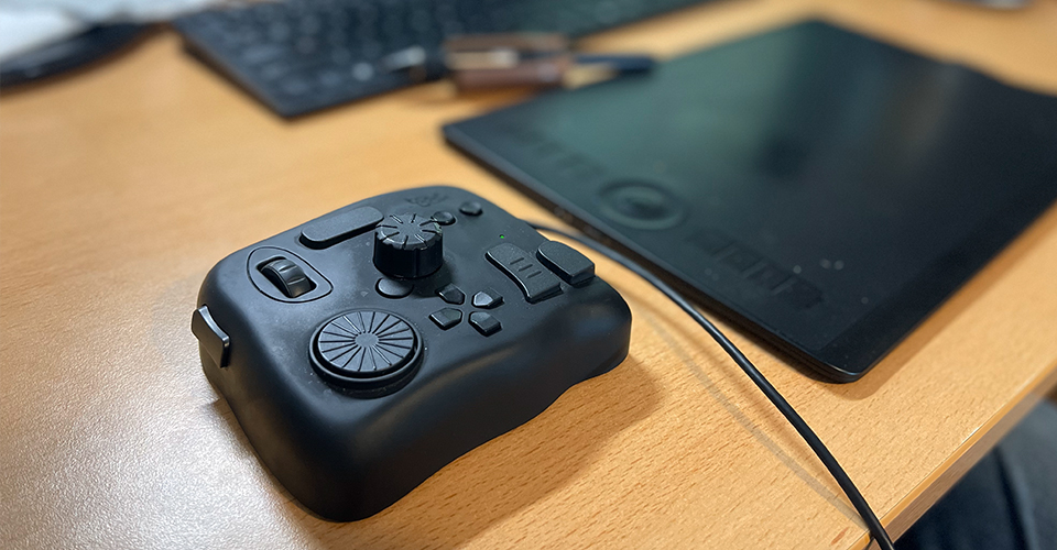
Keyboard Short Cuts: Do I use keyboard shortcuts? Absolutely, and they are fantastic, but I recently got a TourBox control, which is even better. I’ve mapped various controls to it that I would never use on my keyboard. This has dramatically improved my workflow and speed. Highly recommended.
Several similar products are available, but TourBox has been the best fit for me. It can also be simultaneously mapped to other software, including Adobe products.
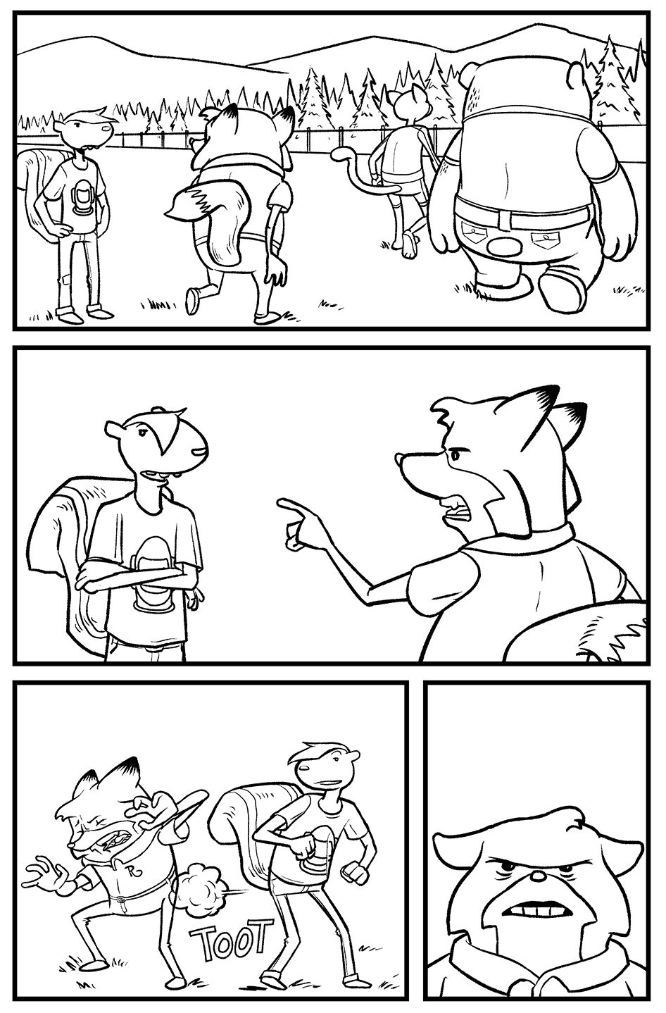
Eliminating Backgrounds: I prefer to keep each page centered around a single scene. One advantage of this approach is that if one panel includes a clear establishing shot of a location, the reader will mentally visualize that location throughout the entire page, even if other panels lack backgrounds. This technique can also be applied to two side-by-side pages, where a single background can serve both pages effectively.
I keep this in mind when I’m thumbnailing. My thumbnails are laid out the same way the final art in the book will be. Meaning the even-numbered page is on the left and the odd is next to it on the right so I can see how they read side by side.
Do use this technique judiciously. I see some comics that barely have any backgrounds. Half the fun of comics is the art. Don’t shortchange your readers.
As I chip away at my graphic novel, every page has something I’d like to be better. I’ve got to keep it moving though. When I’m done, I might revisit and address a few aspects that truly bother me. In truth though, those are often minor details that readers are unlikely to notice or care about. So I endeavor to work faster by not fixating on those things and to improve with each new page and project.
Favorite Thing I Drew This Month
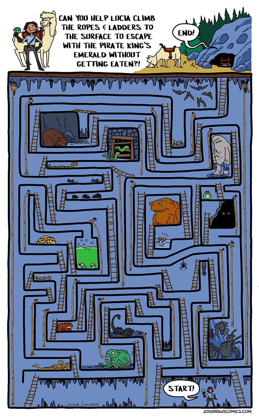
I did this for the Hey Kids Comics! zine. Hey Kids Comics! is a shop in Brooklyn that specifically focuses on comics for kids. They have a monthly subscription where they send out a new kid’s graphic novel along with their monthly zine. This was my contribution to the latest issue.
Family Stuff
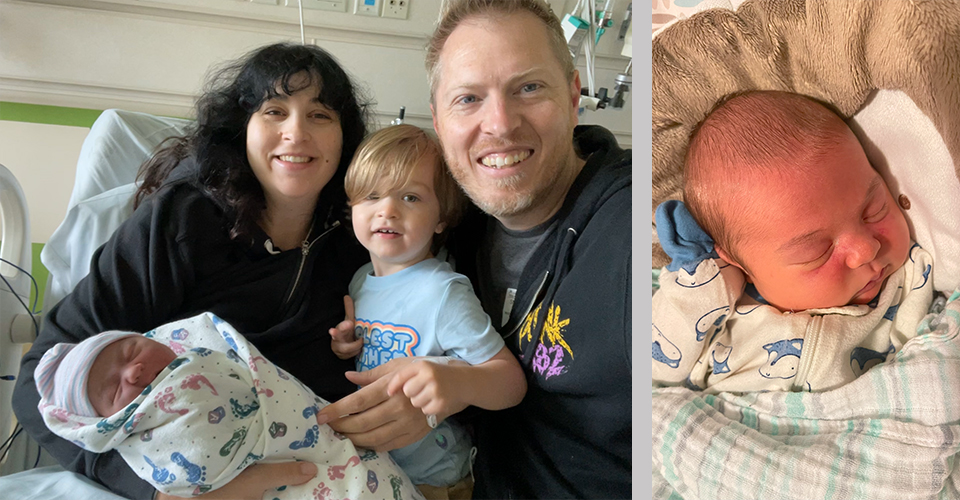
The Smeaton family just got a little bigger. 8 pounds, 5 ounces bigger. We welcomed Penny to the family at the end of May. Mom and baby are doing great. River has been wonderful with his new little sister. It probably didn’t hurt that she got him a new truck and excavator as a present.
Did you enjoy reading? Subscribe to The Kid’s Comics Creator newsletter and get articles like this directly in your inbox the first and third Wednesday of the month.
